As a Blue Dot’s Lead Product Designer, I guided the UX/UI evolution of the AI-powered, cloud-hosted tax compliance solution which uncovered the transformation of a multifaceted application into an accessible and engaging user interface.
Project Overview
As the Lead Product Designer at Blue Dot, my challenge was to redesign our tax compliance software, making its sophisticated features simpler for users to navigate. This project transformed an AI-driven, cloud-based platform into an easily understandable tool, making complex tax tasks feel straightforward and accessible.
NAVIGATING COMPLEXITY: Leading UX Redesign for Blue Dot's AI Tax Compliance Platform.
Problem Statement
The key problem was transforming a complex, feature-rich tax compliance platform into an intuitive and accessible solution without losing any of its powerful functionality.
Challenge
The primary challenge lay in modernizing an outdated interface without compromising the product’s advanced features. Striking a balance between the intricate aspects of tax compliance and a clear, user-friendly design was essential.
Design Process
Development Process
We adopted an Agile methodology, utilizing Jira boards for meticulously structured sprints, focusing on refining our designs. Central to our approach was the continuous collection and integration of user feedback, vital for transforming our wireframes and prototypes into clearer, more intuitive interfaces.
Wireframes
I engaged in an iterative design process, continuously testing and refining the wireframes to improve interface accessibility and ensure intuitive interactions.
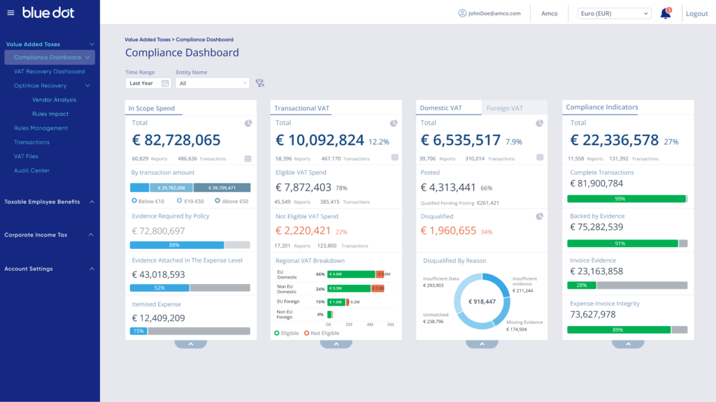
Outdated Design
The original design fell short in terms of accessibility and interactivity, presenting challenges for users in navigating and utilizing the platform’s full capabilities.
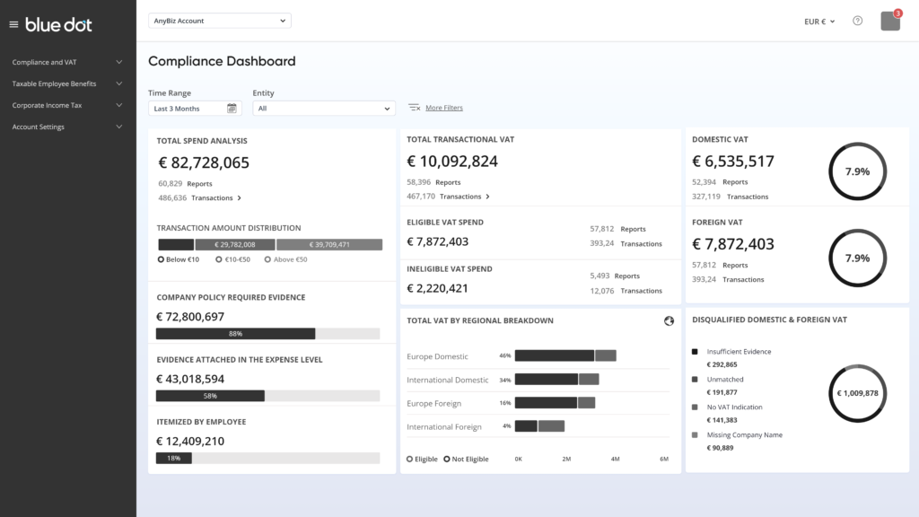
Revamped Wireframe
Through iterative design and continuous testing, I refined the existing wireframes, focusing on enhancing accessibility and intuitive interaction within the interface.
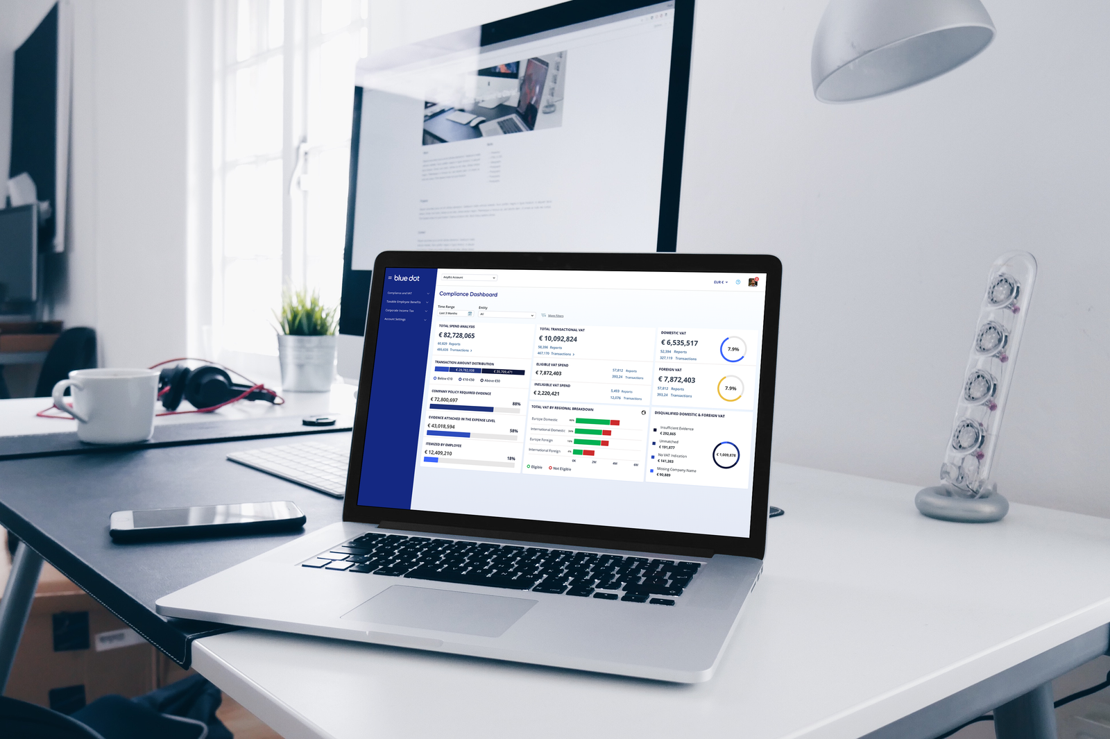
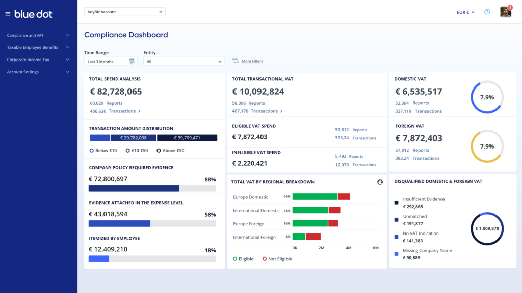
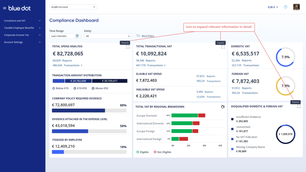
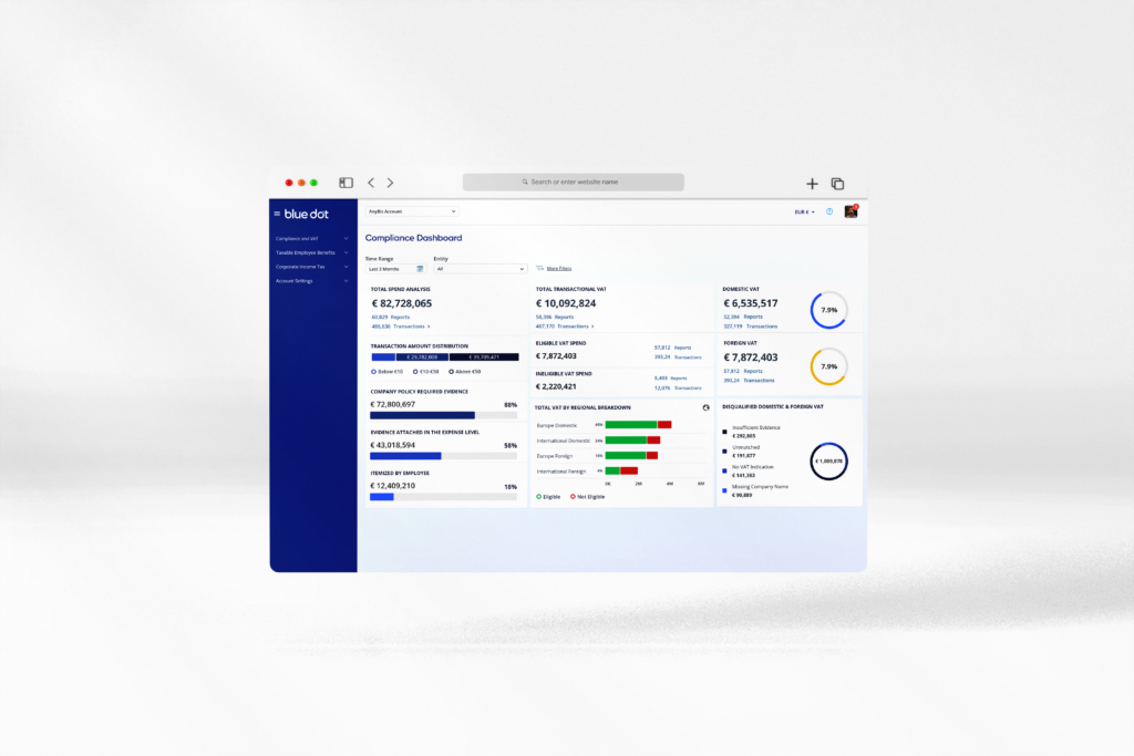
New Accessible UI
We transitioned to a sleek, modern UI that prioritizes accessibility, making complex data effortlessly comprehensible. This new design not only enhances visual appeal but also significantly improves the ease of data interpretation for users.
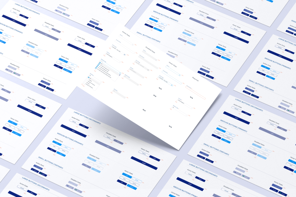
Design System
In developing our design system, I worked closely with the development team to ensure smooth integration. This collaborative effort streamlined our workflow and guaranteed visual consistency across the platform, enhancing both efficiency and cohesion.